Tableau Analytics is a software that nonprofit organizations can use to better understand their data and improve their bottom line.
With its help they can improve their fundraising efforts, create more successful events and campaigns, and learn how to have a greater impact on the world.
In this blog post, we’re going to cover 10 ways nonprofits can use Tableau Analytics for their success.
Fundraising analytics
Tableau allows large and small non-profit organizations to better understand the data behind donations.
It can help you find insights in your donor data which can allow you to do a better job with your fundraising initiatives.
By looking at the data, you can understand how supporters are interacting with your organization.
You can see the emails that they opened, what content they read and responded to, at what time do they give donations and at what amount.
All of this data could be used to better understand how to keep your donors engaged and happy.
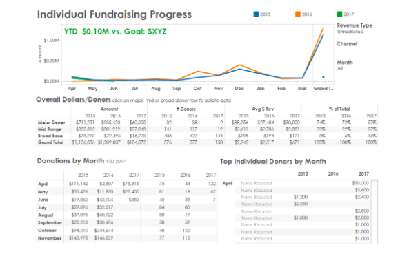
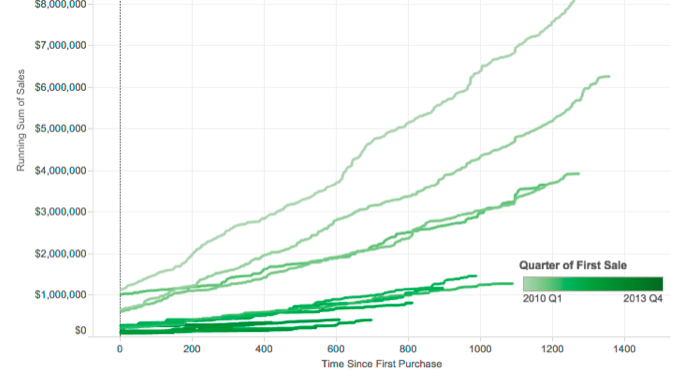
For example: at Grameen Foundation they use several retention dashboards to better understand the behavior of their donors.
The dashboards themselves give a quick look when it comes to things like major gifts, mid-range gifts, or annual giving, as well as individual transactions.
With a simple click of a button you can get additional information about your donors that can help you keep your donor retention at desirable levels.
The fundraising data that you get from Tableau is also good to be used by different departments within the non-profit organization.
That way program teams and fundraising teams can use it to reach to a mutual agreement when it comes to their campaigns.
Use Events Data to Better Understand How They Impact Your Non-profit
Events are crucial for the success of any non-profit organization.
However, they always require a lot of resources that need to be calculated properly. This includes time, money, effort, etc.
Tableau Analytics allows you to better understand the data behind past and present events so you can create more efficient ones into the future.
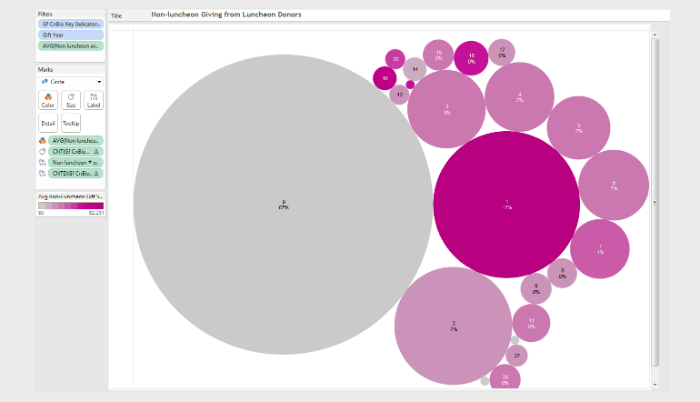
For example: The Pike Place Market Foundation (PPMF) used Tableau Analytics to find out that 67% of luncheon donors never made another donation outside their luncheon.
At the same time, only 13% made one additional donation to the organization.
That’s very little traction for 80% of attendees of a luncheon that is costly to put on and is the only event to take place outside of the iconic market.
So based on this information, PPMF decided to end its annual luncheon and redirect its time and efforts to smaller events that create more lasting relationships.
Maximize your end-of-the-year fundraising
The end of the year is the most important time for any non-profit organization. This is when 20-50% of their revenue is typically raised.
So to make their fundraising campaigns more successful, nonprofits can use data on previous years, individual donors, past events, etc.
This can help them better understand how to influence donor more successfully and improve their bottom line.
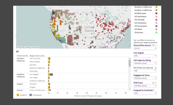
For example: the fundraising team from the University of Washington uses the the Purple People pyramid to segment donors and calculate how much they can donate and how much it will cost them to obtain it.
The visualized data allows non-profits to see which donors are most likely to donate based on factors such as zip code, gender, income, etc.
You can easily see who has given donations in the past, who has children at the institution and who’s an alumnus.
This data is extremely valuable to non-profits then they are in the extreme pressure by the end of year.
Better Understand Advocacy and Public Research
By using Tableau data you can tell an emotional story that helps non-profits influence policy makers and make their message stick in the public consciousness.
This is extremely helpful when you’re promoting public accountability, sharing research on complex issues, or educating people about public issues.
For example:
Individual school districts might have tons of student data but it might be hard for them to understand it. They might not know which schools are doing well and why.
So to understand this better Shelby Cooley built the Road Map Project Data Dashboard.
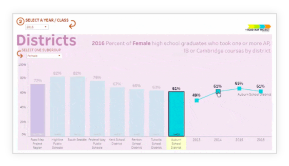 The dashboard allows him to dig deep and understand what affects school performance.
To understand this he looks at the demographic data by ethnicity, income, gender, and other factors.
So the Road Map Project Data can be used by everyone from legislators to community organizations to individual parents to help them make decisions about the best way to educate and support children across the Seattle area.
Impact Reports
So in order to keep donors engaged, non-profit organizations need to show results and prove the effectiveness of their work.
But the problem with this is that building reports can cost your organization hundreds of hours and thousands of dollars to produce.
This is where Tableau is helpful because it allows you to easily use your data to tell a story and prove that your work matters to the world.
 For example:
Krochet Kids, a nonprofit organization focused on empowering women and lifting them out of poverty, is using Tableau to prove the effectiveness of its programs in developing countries.
To analyze the progress that each woman is making, Krochet Kids collects data on 45 indicators for every woman in its program, every month.
These indicators include economic factors, educational progress, health data, and psycho-social information.
Indicators are compiled in Tableau dashboards which are published to a secure server so that anyone (including donors) can explore the data and see how each woman is progressing.
With Tableau Analytics you can go beyond of just showing to people what you did last year. With the Living Annual Report you can also show to people what you’re up to this week.
With its help you can share your latest information and save time and money on producing a traditional printed piece.
Visualize and Understand Your Excel Data
Most non-profit organizations use Excel to store and analyze data, and perform calculations.
Tableau brings this to a whole new level by allows you to leverage visual analytics and new ways to interact with and analyze data.
This allows users to visually interact with data to find insights faster, and make critical decisions that better serve the community, improve programs and campaigns, or even save lives.
So by looking at the data visually you can get an idea of how to improve your day-to-day work at your non-profit organization.
Something that you could miss if you’re looking at just spreadsheet numbers.
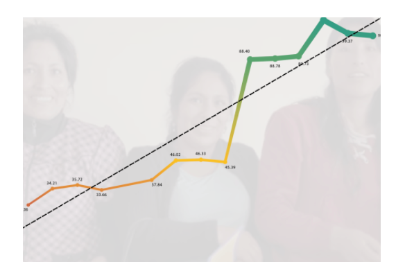
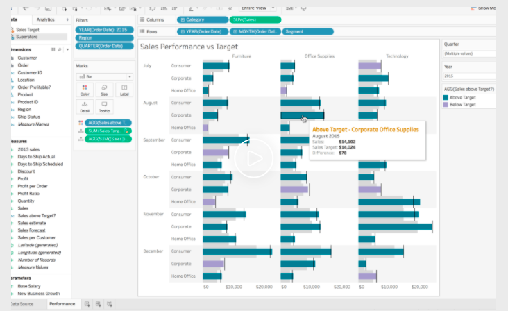
Predictive Analysis
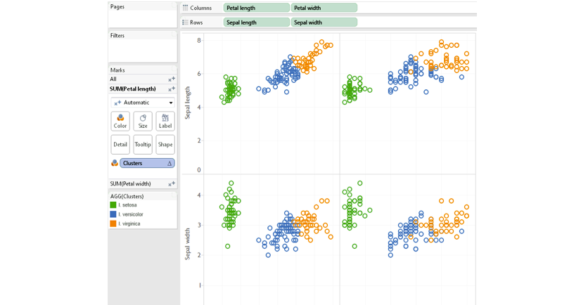
Nonprofits can use Tableau’s powerful out-of-the-box stats and predictive technologies to codify theses and uncover latent variables.
For example: organizations can use its native modeling capabilities to tap into trending and forecasting data.
 This allows them to add a trend line or forecast data to any chart. Then with a simple right-click you can view details describing the click.
You can also use drag and drop to model different groups and compare data.
The good news is that these predictive analytics are fully integrated into the front end and can be easily segmented.
Not only this but by combining this front-end data with powerful input capabilities, you can quickly modify calculations and test different scenarios.
Sophisticated Calculations
Tableau’s robust calculation language makes it easy to augment your analysis with arbitrary calculations and perform complex data manipulations with concise expressions.
With calculated fields, you can easily perform arithmetic operations, express conditional logic, or perform specialized operations on specific data types.
Two key capabilities that enable advanced analysis are Level of Detail (LOD) Expressions and Table Calculations.
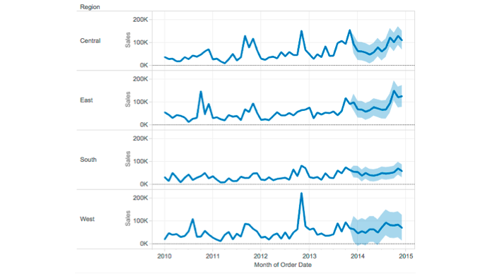
 Since much of the world’s data can be modeled by time series, Tableau natively supports rich time-series analysis.
You can explore seasonality, sample your data, or perform other common time-series operations within a robust user interface.
For example:
A visualization could be used to shows the tipping patterns from all the taxi rides in New York City.
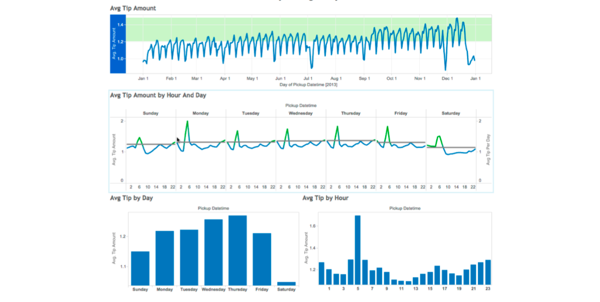 You can adjust it to find interesting patterns.
With a single click, you can disaggregate the data or view the entire time series sampled by an arbitrary window.
You can quickly change aggregation frequencies to look for seasonality over different timescales or even view year-over-year (or quarter-over-quarter) sales growth.
The R plugin allows you to use the front-end data from Tableau and combine it with external data from prior work in other platforms.
Tableau can connect to an Rserve process and send data to R via a webAPI.
The results are then returned to Tableau for use by the Tableau visualization engine. This allows a Tableau user to call any function available in R on data in Tableau and to manipulate models created in R using Tableau.
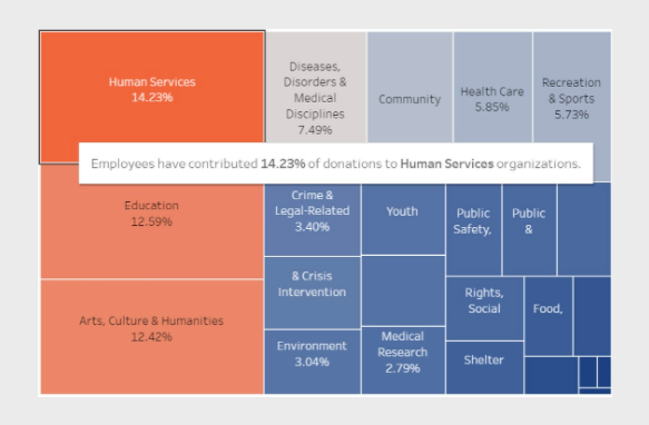
Human Resources Analytics
Every non-profit organization needs people in order to function and execute all of its campaigns.
At the same time, all of these people need to be managed properly to be able to succeed with your efforts.
With Tableau analytics you can get access to data that will help you hire, retain, and invest in the best talent so you can utilize your human resources effectively.
You can visualize your data to learn more about your team’s productivity.
You will be able to see things like which hours they worked and how they performed different tasks so you can optimize their performance.
In Conclusion
Tableau Analytics could be a powerful tool for any non-profit organization.
With its help you can understand the behavior of your donors and improve your fundraising initiatives.
The data will also allow you to see how you can optimize your end-of-the-year campaigns so you can ensure you can optimize your revenue generating activities and meet your goals.
With Tableau you can also better understand the data behind events and how each one of them of them contributes to the success of your organization.
You can also use the data to tell an emotional story and make an impact on people.
Tableau can also help you create impact reports to prove to your stakeholders that your work matters and you’re getting results.
Not only that but you will be able to visualize and better understand your Excel data, as well as combine Tableau with 3th party data.
Tableau can also help you perform predictive analysis, sophisticated calculated and learn to manage your human resources better.
The possibilities are limitless and good news is that Tableau is completely free for non-profits with an annual operating budget under $5 million.