Data visualization is used everywhere.
Businesses use it in forecasting, marketing, and reporting, reporters to contextualize stories and show trends, and scholars or scientists to explain concepts and reinforce arguments.
For nonprofits, data visualization not only makes their work more professional but is mainly used to put stories and faces to numbers.
To be highly effective, it’s important to design visualizations the right way so that others can interpret and make decisions easily based on what they see.
How do you do that? By using the best types of data visualizations and answering the main questions in the minds of your audience.
Data visualization can also help nonprofit staff and boards get a handle on huge amounts of data while quickly seeing its significance to the organization.
When done right, it’s easy to share with grant makers and donors to help them familiarize themselves with the impact, program scope, or finances of your nonprofit.
We’ve rounded up a few great nonprofit data visualization examples you can use for some inspiration.
Nonprofit Data Visualization Examples
Behind every mission statement, image, and data point, there’s always a great story.
However, raw data doesn’t always tell compelling stories and words don’t always paint crystal clear pictures.
Data visualization is a powerful communication tool that helps your nonprofit’s stakeholders and audience understand your data.
We’ll look at the data visualization examples under the following categories:
- Temporal: linear and one-dimensional visualizations that feature standalone or overlapping lines, with a start and end time
- Hierarchical: order groups within larger groups and are suitable for displaying information clusters especially if they flow from one point of origin
- Network: show how datasets relate to other datasets in a network without using wordy explanations
- Multidimensional: has two or more variables that create a three-dimensional data visualization and tend to be eye-catching and vibrant. They break down a ton of data into key takeaways.
- Geospatial: relate to real-life physical locations and overlay familiar maps with different data points
Here are some data visualization examples you can use to tell your nonprofit’s story in a data-driven world. We’ve also included examples of different data visualization types, plus when and how you can use them for your nonprofit’s presentations, reports, and more.
1. Infographics
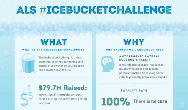
Image: The Modern Nonprofit
Infographics are an easy way for nonprofits to spread awareness for their cause and attract supporters. You can quickly integrate graphics and words into a clear, fun, and dynamic design, or combine other kinds of data visualization and present text or numbers graphically.
This type of data visualization serves a wide range of purposes such as offering how-to instructions or comparing two things.
You can animate your infographics, tell a story through text, data, and pictures that even the most math-phobic person can understand.
If you don’t have an in-house designer or are hard-pressed to find volunteer designers, you can use online infographic templates. This way, you can create powerful visuals that boost donations, show where the money goes while building confidence and raising your supporters’ trust.
2. Timelines
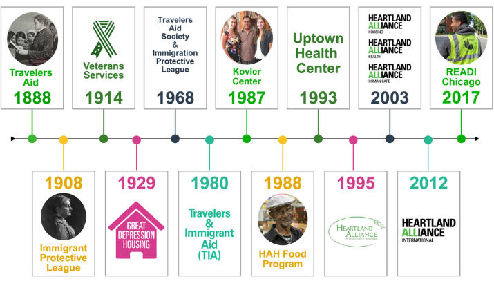
Image: Heartland Alliance
Timelines help you display your data chronologically such as your history or the process behind your nonprofit. You can provide your donors and other stakeholders or supporters a captivating visual of your organization’s progress and future hopes.
Timelines are easy to follow and give an inside look into how the need for the nonprofit and cause started and how you’re doing so far.
You can illustrate the history of your projects and graphically convey chronology in a compelling way. Plus, timelines are a good way to encourage your supporters to act as you elegantly tell your nonprofit’s story and progress.
3. Maps
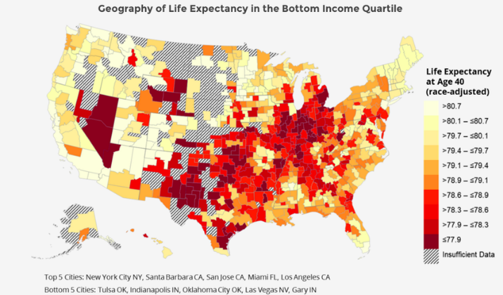
Image: High Tower Advisors
Maps are a fun way to visualize your nonprofit’s data because they have a language of their own. With a map, you can reflect outreach, growth, and impact besides adding visual elements to show where the donor funds are going, where you’re located, and your reach.
Maps are especially helpful for nonprofits whose work is primarily across the borders. You can help the public see and understand how their efforts have impacted the world, and make your mission feel more tangible.
You can bridge the gap between donors and clients by organizing data geographically and telling the important story of your nonprofit.
One of the most popular types of maps is heat maps. Heat maps display correlation in your data elements. Such maps use various colors or saturation to show low to high correlation.
You can use a single color or vary the color to display the range. For instance, if you use orange, you can use saturation from light to dark orange.
Another type of map is the treemap, which visualizes relationships between multiple data variables. Treemaps break down such relationships and are strictly used to show how your programs roll up into different categories, for example, in a hierarchical relationship between the programs you run.
4. Graphs
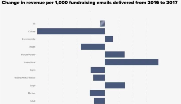
Image: Double the Donation
Graphs are a straightforward form of data visualization. If you use Microsoft Excel in your nonprofit, it should be easy to create graphs.
Graphs help you demonstrate to your stakeholders where funds go, campaign progress over time, how severe a problem is, and many other statistics.
You can turn information from your nonprofit into easy-to-swallow pictorial figures that tell a story. You can also share the graphs as images and use them to show how your nonprofit uses the support it gets.
Some of the popular graphs you can use are bar graphs, line graphs, and histograms. The histogram displays data distribution over a certain time or continuous interval.
Plus, histograms combine line and bar charts and give estimates as to where values are concentrated, as well as gaps, unusual values, and extremes in the data set.
5. Charts
Charts are perhaps the most common form of data visualization for nonprofits. They visualize processes, show the flow of funds into programs and impact, break down fund allocations, and provide the reader with a layer of analysis.
Some of the most common charts include:
- Bar chart: for data with categorical and numerical values, and show data distribution like the number of program attendees. They convey multiple variables in one chart and can be color-coded for comparison purposes.
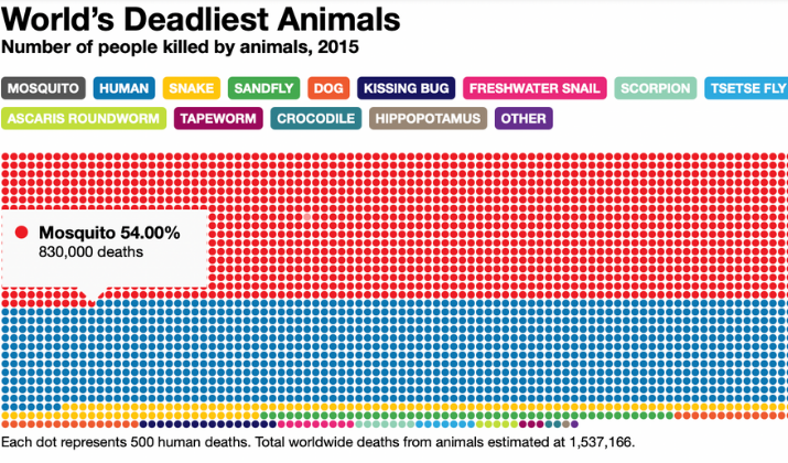
- Interactive chart: these charts look like maps but are interactive or animated. A good example is the interactive chart by the Gates Notes about various creature heavyweights in the animal kingdom.
- Pie chart: this chart is used frequently and involves data with small variations. You can convey different types of programs that your nonprofit provides and break them down using the pie chart.
- Line chart: this is excellent for data involving long periods of time. You can illustrate data changes such as growth trajectories or declining patterns. Line charts are best suited for numerical data or data gathered over time that shows trends.
- Dual-axis chart: if your data is in different sets, a dual-axis chart is the best method to convey it visually. You can use it for datasets with one categorical variable and two numerical variables, for example when comparing the total amount spent on a workshop versus the number of workshop attendees.
- Scatter plot chart: this type of chart displays data points on two axes as dots.
- Bubble chart: this is similar to scatter plot charts, but uses larger dots that look like bubbles. You can use this chart when you want to combine two to three types of data, for instance when plotting program attendees’ ages versus the total number of workshop hours. In such a case, you can use the bubbles to show relationships by male or female.
- Radar chart: this chart helps you understand differences in data items making it easier to compare them and find what may need further investigation.
- Area chart: this is similar to a line graph but highlights the item differences better. You can use it to display how different items contribute to the whole or how they stack up.
- Funnel chart: this chart displays steps and the rate of completion for each step. You can track and represent how something moves from one stage to another in a process.
6. Tables
Image: Depict Data
If you want a mix of everything in your data visuals to help with decision-making, you can use tables. Tables display graphics and data points like icons, bullet charts, and sparklines.
You can use tables to organize your data for reporting, using rows and columns so you can see everything in one place. Just try not to have too many of those.
If you have a dashboard with many metrics, tables can be overwhelming. Thus, you need a happy medium that works for all your data, no matter how large or small.
Tables can express a wide range of numeric values so that your audience can see patterns and understand insights.
7. Box Plots
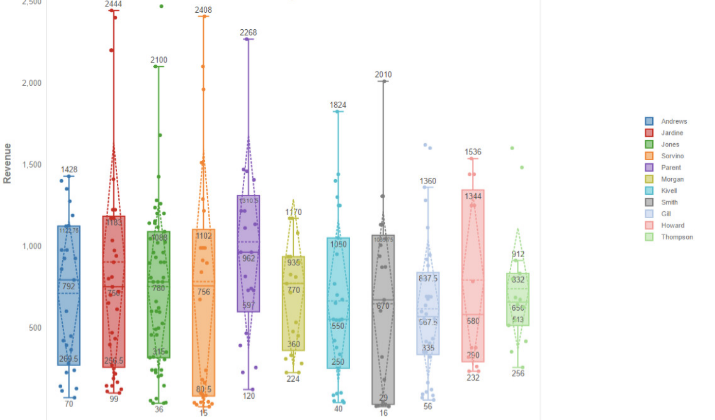
A box plot visually represents how your data is distributed. Also known as box and whisker diagrams, this data visualization type is based on a five-number summary that includes the first, second, and third quartile, along with the minimum and maximum.
A simple box plot shows the outliers, a typical value, full range of variation from the minimum to the maximum, and likely range of variation.
For best results, make sure you use big font sizes for legends and labels, thick line widths to help you understand findings easily, and remove unnecessary clutter from the plots. Try to use different line styles or colors and symbols to differentiate your data.
8. Indicators
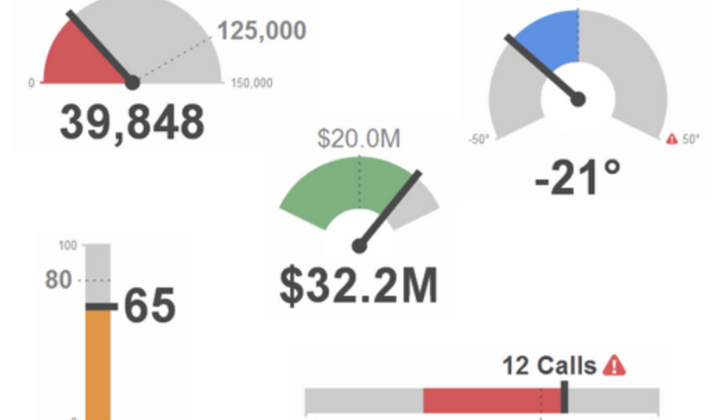
Image: HubSpot
Indicators help nonprofits glance at views of metrics that they need to track or monitor. In short, an indicator is a number that shows the current value of the performance metric you want to track or monitor.
You can add comparisons to the previous time periods to display to your readers or audience whether the metrics are tracking up or down. You can use gauges or tickers to make your indicators fancier and present your data differently.
9. Gauges
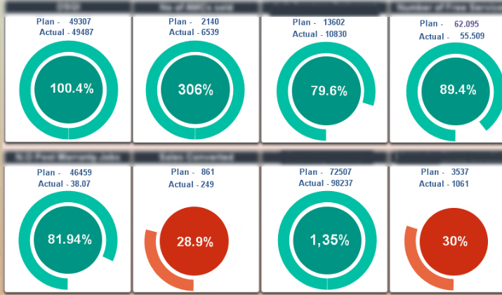
Image: Qlik
A gauge compares two values on a single scale – the target value and the current value – which usually indicate whether your nonprofit is doing well or not.
You can use two colors, usually red or green in the indicator, and track single metrics with a clear objective.
However, if you want to track multiple metrics or visualize precise data points, gauges aren’t the best choice of visualization for these purposes.
When using gauges, you can play around with the shape and size, whether it’s a line, arc, or circle, keep colors consistent in terms of what means good or bad, and your metrics.
Make sure the colors are consistent and your labels match throughout so that it’s easier to identify relationships and keep data in order.
10. Sparklines
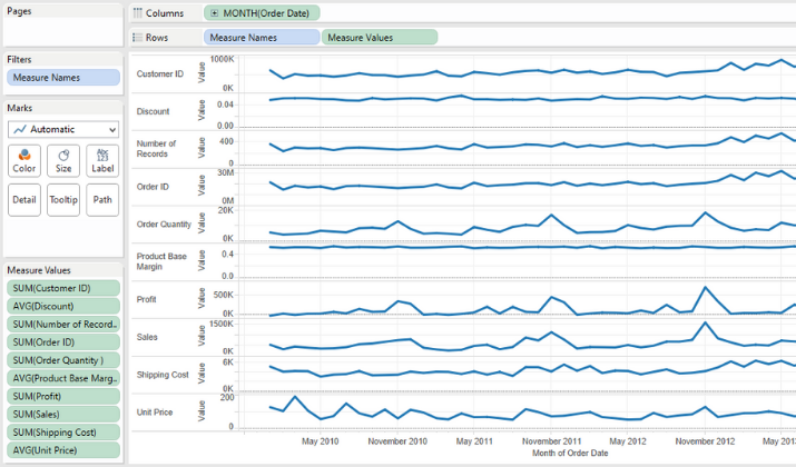
Image: Evolytics
Sparklines are one of the most compact and best ways to show trends in your nonprofit’s data. They paint a picture for your audience fast, especially if they already understand how to study the sparklines.
You can use them to show metrics tracked over a specific time period, and show specific trends behind your metrics.
When using sparklines, add indicators on the side to give your viewers a better glance into your data and stick to one color to keep the sparklines consistent.
Wrapping Up
For nonprofits, data visualization provides a powerful way of elevating reports and making them more engaging while conveying more information than words can do.
Regardless of the tools you use to visualize your data, you need to get the right visualizations based on the type of data you have and the key insights you’d like to highlight.
Remember to keep your visualizations clear, concise, and clean to ensure your audience gets the message, and your facts shine through in relation to your overall narrative.